Work / Publisher Merchandising
Publisher Merchandising
Amazon · UX Designer · Spring 2023 to Fall 2023
Design goals
Revive slot performance
Reverse a multi year decline in publisher slot clicks and conversion by creating designs that appease customers
Empower publishers creatively
Build flexible template options that let publishers surface their catalog with more impact and creative ownership
Elevate the page experience
Design slots that felt native and premium on the new Books genre pages rather than stale and ad like
Project timeline
Publisher Merchandising · 6 months from onboarding to handoff
The story
“Amazon started with books. And for the major publishing houses that have long called Amazon home, the Books genre pages are prime real estate. That opportunity had been sitting on the same design for ten years.”
By spring 2023, publishers were seeing a 32% decline in clicks and conversion over three years. Customers had become so familiar with the existing slot designs that they scrolled right past them, mentally filing them as another ad before their eyes even registered what was there. Meanwhile the Books genre pages themselves were undergoing a massive visual overhaul. The existing publisher merchandising slots were not just underperforming. They were about to look completely out of place on the new pages.
Something had to change. I was handed the project.
My role: UX Designer, Publisher Merchandising. Working under the guidance of my manager and in close collaboration with a PM and four marketing managers, I owned the visual and interaction design of three distinct merchandising slots from exploration through handoff. I built on early explorations from a senior UX designer who initiated the project, developed the design direction, template system, and publisher creative guidelines through the core of the project, and handed back to her at the end to support final specifications and launch.
The sections below walk through how I got there.
For publishers
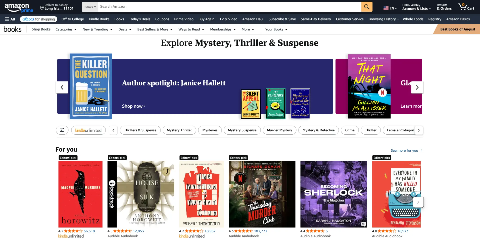
Publishers buy placement slots on Books genre pages at different price tiers depending on position. Above the fold commands a premium, below the fold is more affordable. For years they had been paying for real estate that was delivering diminishing returns. The designs had not been touched in a decade. The slots felt stale, flat, and increasingly invisible to customers who had seen them hundreds of times.
What publishers wanted was not just a visual refresh. They wanted more space to surface books, more opportunity to showcase their catalog, more visual impact that would actually stop a customer mid scroll.
For the business
A 32% drop in clicks over three years is a meaningful signal. Publishers were questioning the value of their investment, and Amazon's relationship with major publishing houses was at stake. If authors and publishers were not getting the exposure and conversion they expected, the entire ecosystem of publisher investment in Amazon's platform was at risk.
The timing of the genre page redesign made this urgent. The existing slots could not simply be carried forward. They needed to be rebuilt for a new visual language, and built well enough to reverse a multi year decline.
For customers
Genre page customers are deeply engaged readers, often browsing for their next series obsession. A slot that looks like every other ad on the internet is a slot they have learned to ignore.
The opportunity was to create something that felt native to the book browsing experience rather than interrupting it. Something that felt like discovery, not advertising. Publishers had compelling catalogs. The design just needed to surface them in a way customers would actually stop for.
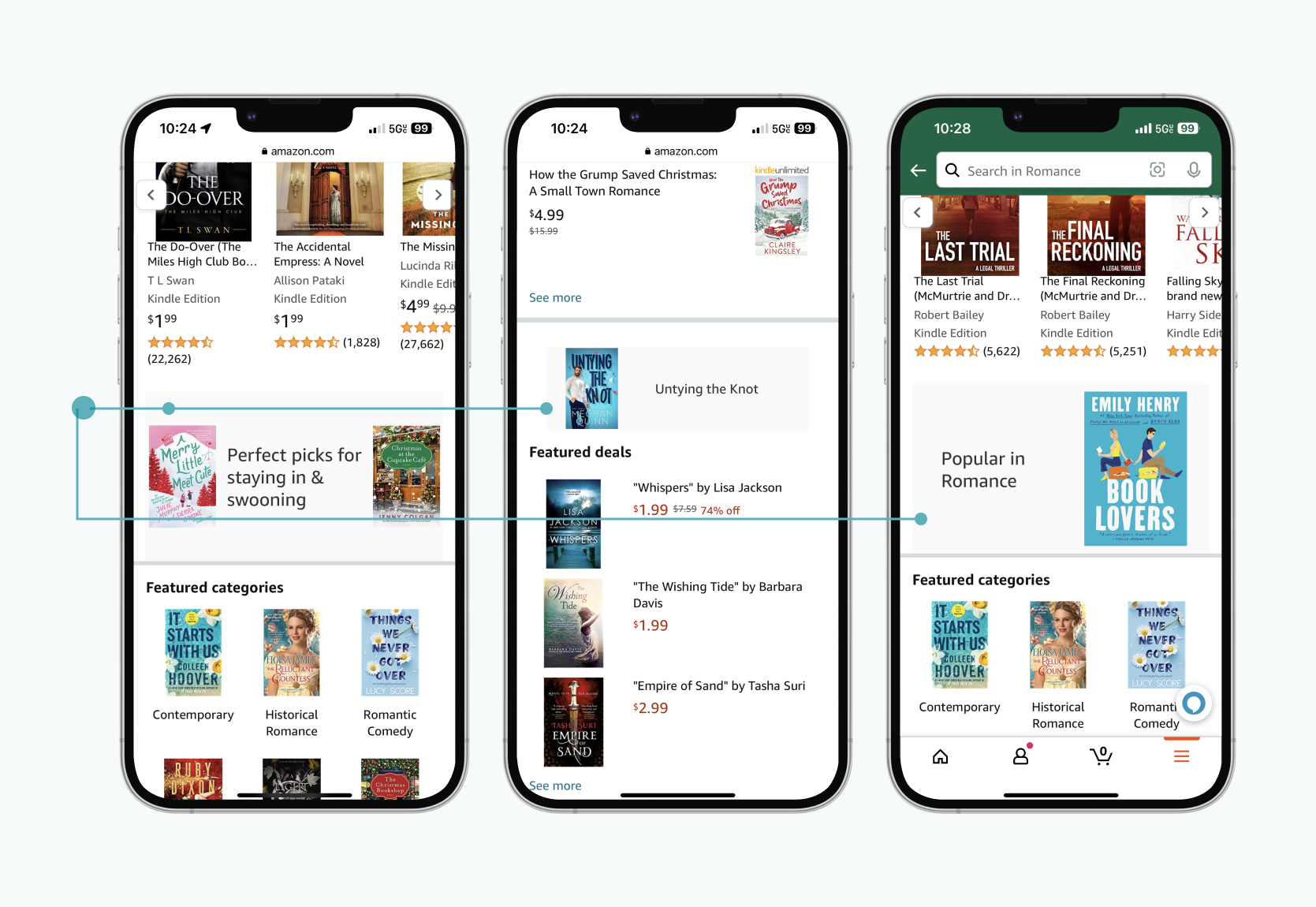
The before. Publisher slots that had not been touched in ten years, blending into the page rather than commanding it.
Discovery
“I never spoke to a publisher directly. Everything I knew came filtered through four marketing managers, each covering a different Amazon marketplace.”
That shaped how I had to work: I could not run a study or ask a publisher a direct question, so I treated my weekly syncs with those four managers as my research sessions. I came prepared with specific questions each time: what was working in the current slots, what publishers said when a design idea was pitched to them, where the friction was in the current process. I also went back through the early explorations from the senior designer who had started this project before me, looking for clues about what earlier stakeholder conversations had already ruled in or out.
Between those weekly conversations and the year over year performance data, a picture started to form. Publishers wanted scale: more books surfaced in a single slot, not one cover sitting alone. They wanted visual impact, something built to stand out on a page full of competing content. And they wanted room to grow: a hero title alongside supporting titles in the same frame, not a fixed layout that could not flex as their catalog changed.
The data backed up what I was hearing. Clicks and conversion on the existing slots had been declining year over year. Publishers had seen the same design for so long that customers had learned to look past it. Familiarity had become the enemy.
The design process
Three distinct slots needed three distinct solutions, each shaped by where it sat on the page and what publishers were paying for that position. The rotating billboard carousel came first, both in priority and in the design process, because it was the most premium placement: above the fold, seen by every customer on page load, and shared by multiple publishers at once.
The rotating billboard carousel
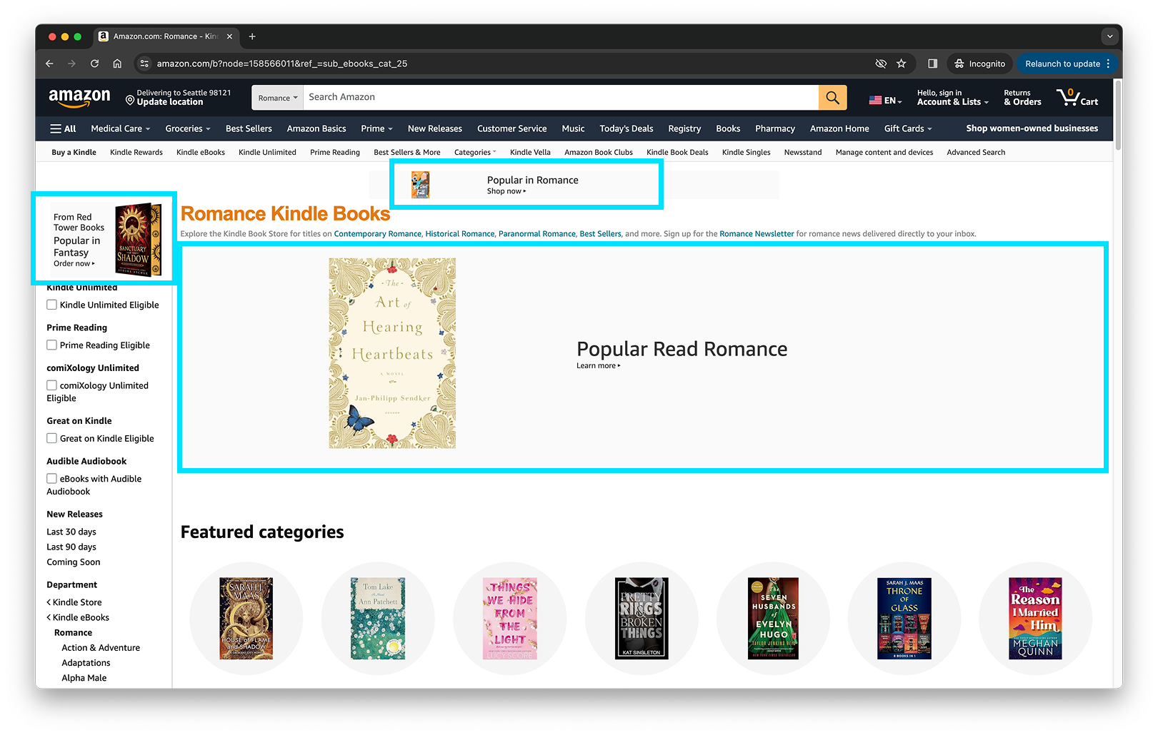
The previous slot design, live for a decade before this project.
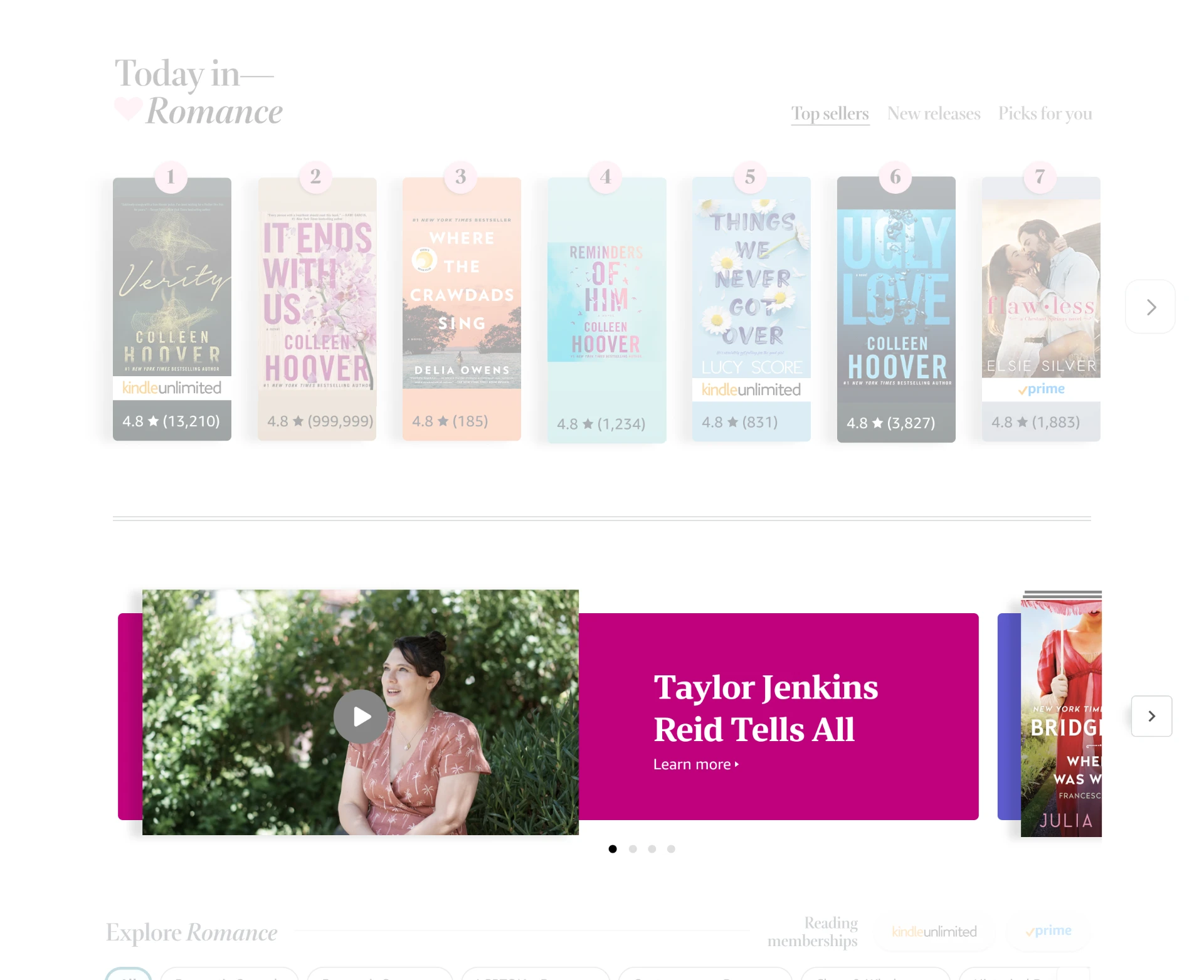
The rotating billboard carousel, as designed.
The first and most premium slot needed to work for multiple publishers simultaneously. Publishers at the same price tier were each paying for top placement. How do you give four different publishers equal access to the most visible position on the page?
Early on, I explored designs that gave multiple publishers space within the same module. Publishers pushed back immediately: they were not interested in sharing a frame with another publisher's books and creative. They had paid for a slot, not a shared shelf. That pushback clarified the actual constraint: whatever I designed needed to give each publisher a sense of full, undivided ownership of the position, even if multiple publishers were technically rotating through it.
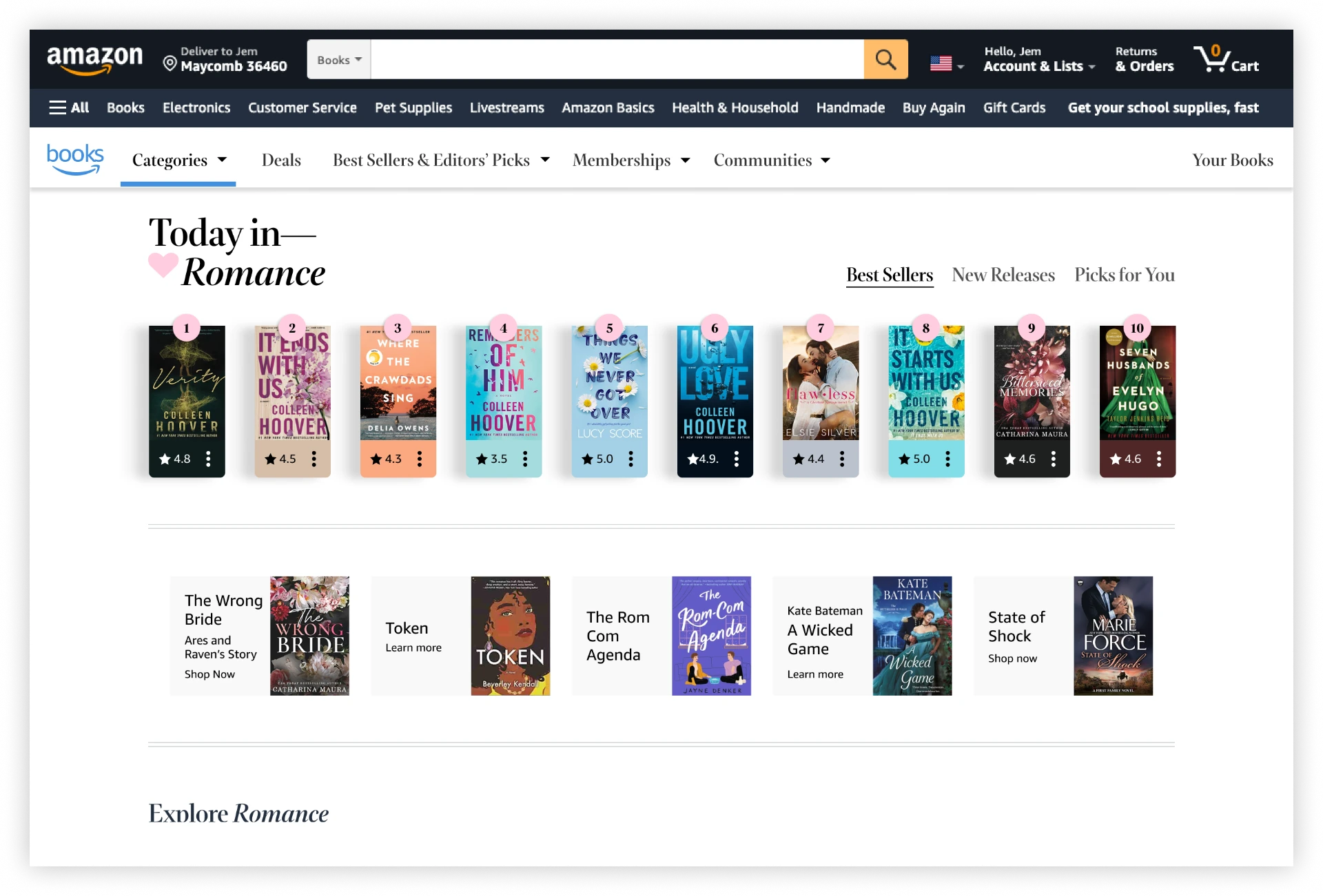
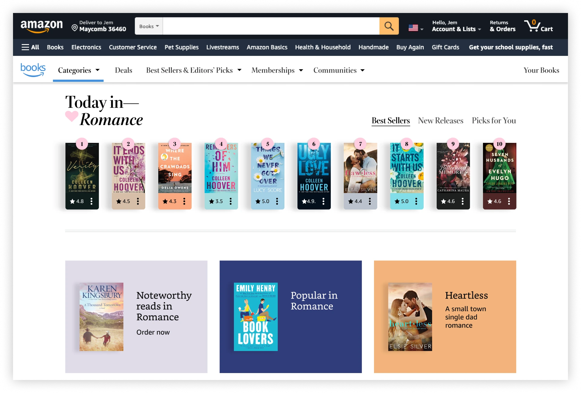
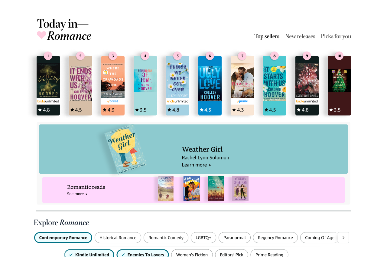
Early directions explored before landing on the final carousel. Several early concepts had publishers sharing visual space within the same module, similar to how multiple listings compete for attention on a single page. Publishers pushed back: they did not want their books competing for attention against another publisher's creative in the same frame. Understanding how publishers actually bought placement, and what they needed from it, shaped the shift toward a rotation model instead.
The answer was rotation. But not in the way most carousels work. Rather than cycling through publishers in a fixed sequence, the slot randomizes per session. Each customer sees a different publisher in the front position on every page load. The result: each publisher occupies the top position approximately 25% of the time across the full customer base, without any single publisher appearing to dominate.
Visually, I moved away from the flat banner concept explored earlier in the project and toward something more dynamic: books bleeding outside the carousel frame, as if they were physically pushing beyond the boundary of the slot. One hero title in the foreground, supporting titles framing it, all of them breaking the container edge slightly.
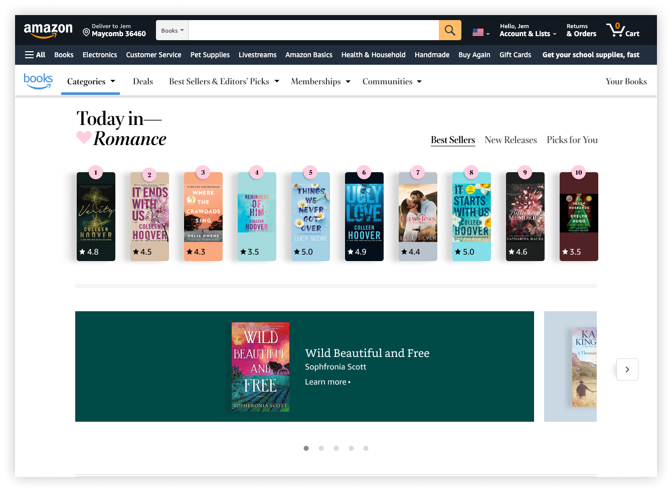
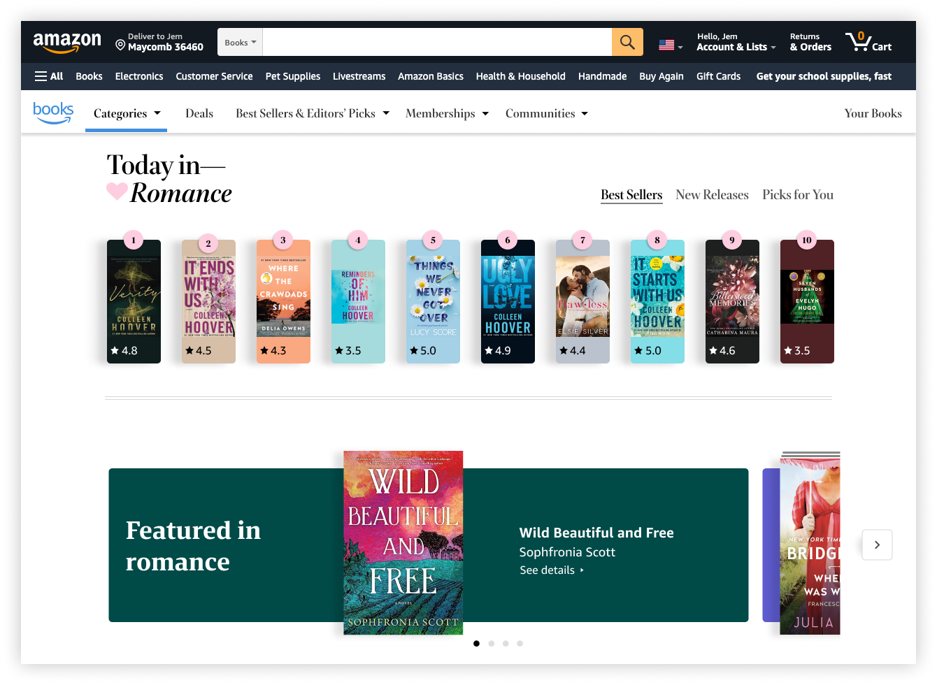
Moving from a flat banner format toward books breaking the frame of the slot.
To give publishers flexibility within this system, I designed four template layouts: one hero book, two hero books, three hero books, and a multi-title arrangement for catalogs with more titles to feature.
The color system was the detail I am most proud of. I wanted the carousel background to feel responsive to the book being featured. Not a static gray or neutral but a color that actually belonged to that title. Engineering's first response was that dynamically sampling pixel colors from book covers in real time would be a significant technical lift.
So I found another way. The Books org was building a new design system with an expanded color palette of 20 to 30 brand colors. I proposed a mapping system: sample the dominant color from each book cover, find its closest match in our existing brand palette, and use that brand color as the carousel background. The lift became manageable. The result was a carousel that felt alive.
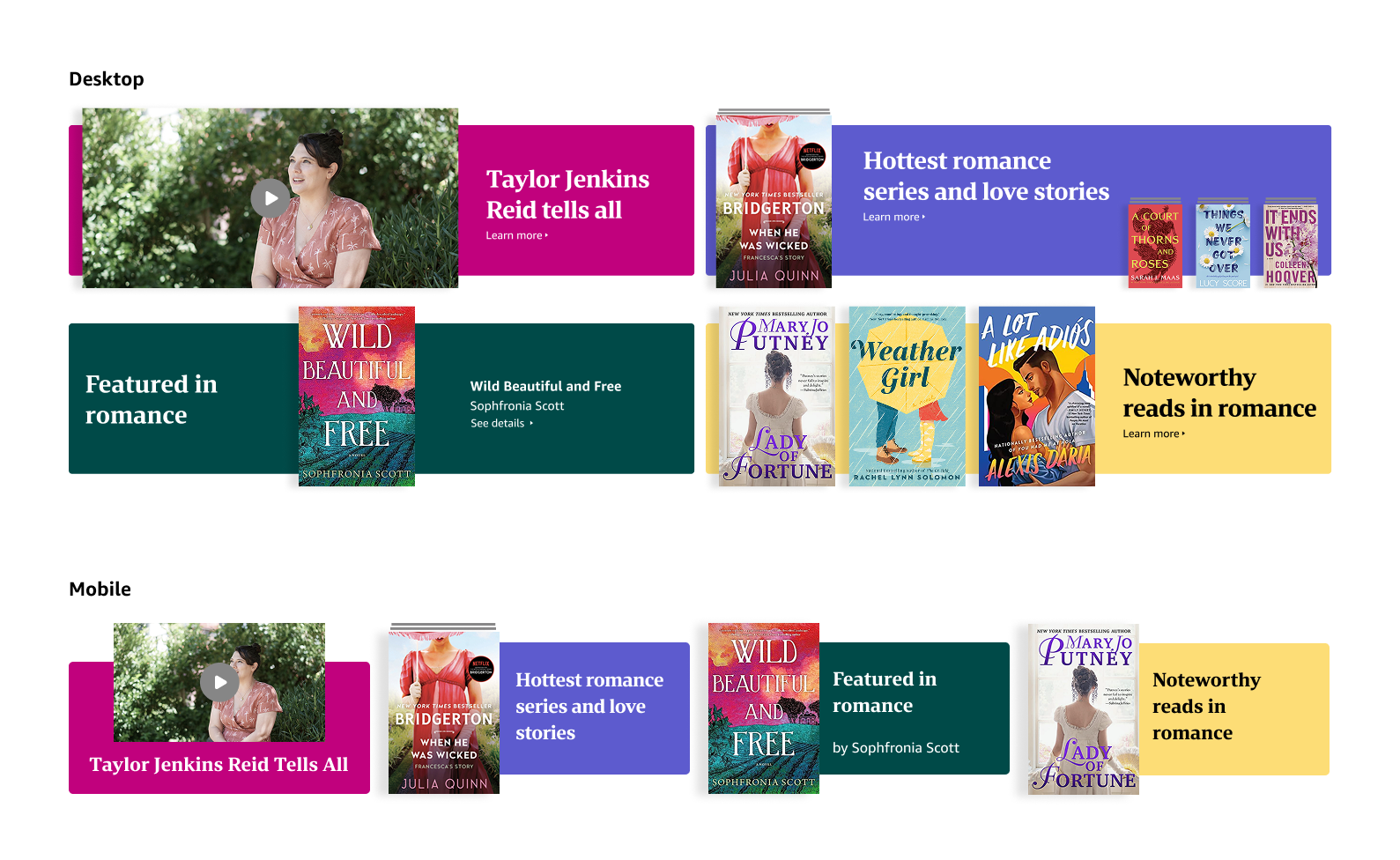
The brand color palette mapping system, applied to the carousel background.
The parallax shelf experience
The second slot sat below the fold, a harder position to earn attention. A static image here, however well designed, would struggle to compete. So I designed something that had never been built in the Books org before: a parallax scroll experience.
As a customer scrolled into this section, books appeared on a shelf. The first book lifted off the shelf, opened to reveal its synopsis, then settled back. A second book followed the same sequence. After both books had been featured, the full shelf of titles lined up, the complete publisher catalog visible at once. Scrolling back reversed the sequence. Nobody in the Books org had built this before, which meant there was no internal playbook to follow. I worked with a motion designer on the team to define the scroll trigger points and the timing of each animation beat, down to the exact seconds each book stayed lifted before returning. But that only solved part of the problem. I also reached out to designers on other Amazon teams who had done parallax work before, found them myself, set up the conversations, and extracted everything I could about what worked and what did not. Alongside that, I worked directly with engineers who had implemented parallax features elsewhere to understand the technical requirements before I finalized the design.
None of that expertise existed in one place. Getting this built meant tracking it down across the company and bringing it back into the room. Accessibility was a major consideration. For users with motion reduction settings enabled, the parallax experience simply would not activate. They would see a static image instead. No information lost, no experience degraded.
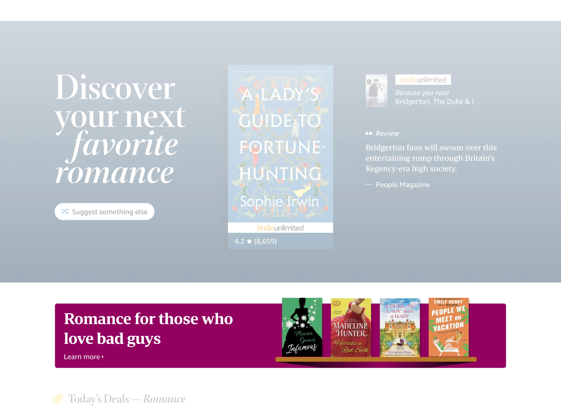
A still image can only hint at how this actually felt to scroll through. The full sequence, along with the other two slots, is shown together at the end of this section.
The shoveler
The third slot was the most straightforward: a horizontal shoveler of books from a single publisher's catalog. I applied the same color mapping logic from the carousel, with the background adapting to match the dominant hue of the featured book. It was a smaller canvas, but it carried the same visual coherence as the rest of the system.
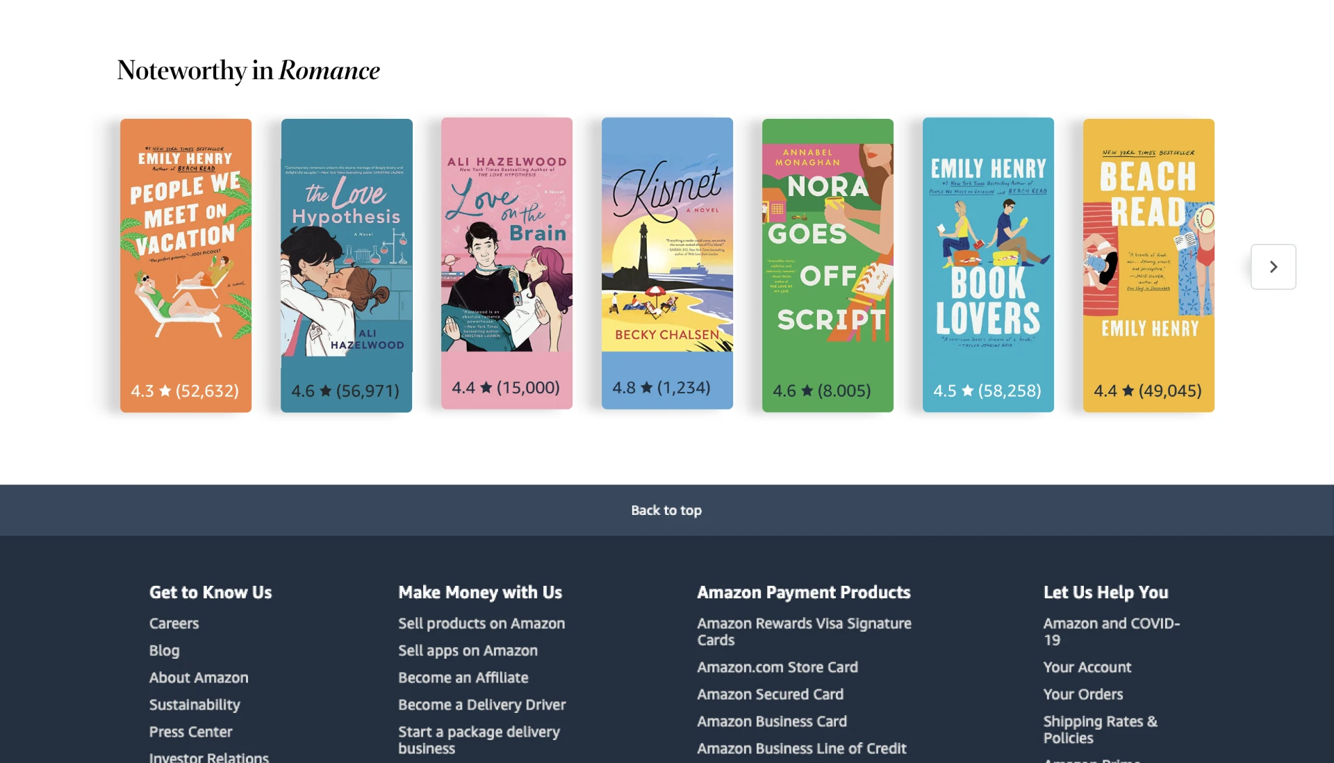
The shoveler, applying the same color mapping system on a smaller canvas.
All three, together
Individually, each slot solved a different problem. Together, they worked as one system: the same color logic responding to whatever book was in frame, whether it was rotating above the fold, unfolding into a shelf, or moving through a shoveler further down the page.
Product Demo
The rotating billboard carousel, the parallax shelf experience, and the shoveler, shown together: three slots, one shared color mapping system.
The publisher guidelines
Alongside the slot designs I built a creative guidelines system for publishers, the first time I had done anything like that in my career. The guidelines specified everything a publisher needed to know to populate the templates correctly: acceptable image formats and dimensions, the angles and compositions that read well in each slot, how many titles could appear in each template, what content was and was not permitted.
The goal was to give publishers genuine creative freedom while maintaining the visual quality and aesthetic consistency of the pages they would be featured on. Getting that balance right mattered both for the publisher experience and for Amazon's design standards.
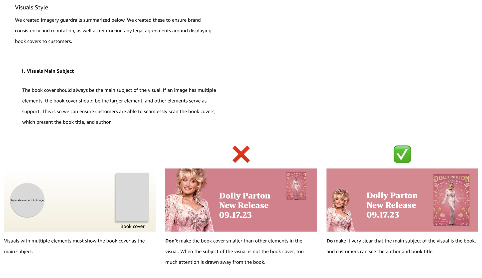
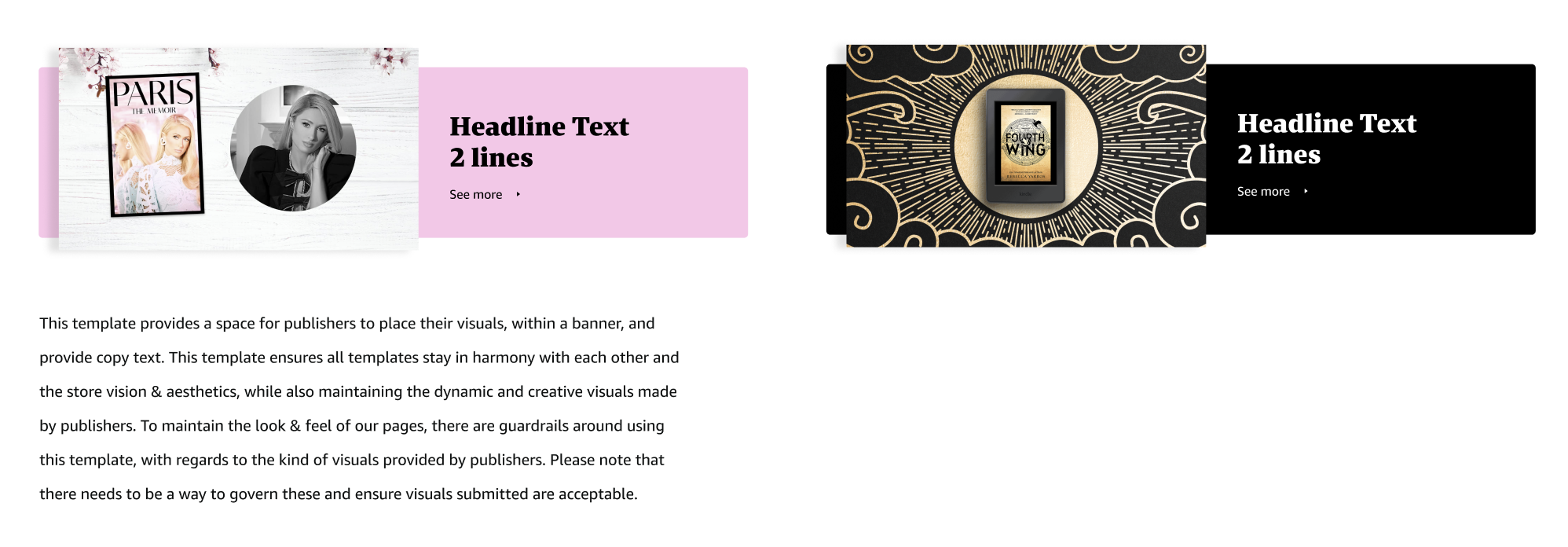
Pages from the creative guidelines built for publishers who wanted more creative freedom within their slots, ensuring their custom creative still stayed consistent with the look and feel of the page.
The tensions
Too many cooks
I was a junior designer at this point, still finding my voice, still building confidence in how I justified design decisions. This project had a lot of opinions in the room: marketing managers, product managers, VP stakeholders, and publisher preferences filtered through multiple layers. Everyone had a vision for what bigger and better looked like, and not all of those visions were compatible.
The hardest part was not the design itself. It was learning to hold a position when I had one, even before I was sure how to articulate why. I got better at that over the course of this project, partly out of necessity.
European market pushback
Alongside the slot designs, I had built a creative guidelines system for publishers: what image formats worked, what angles read well, how many books could appear in a slot, what content was and was not permitted. The goal was to give publishers real creative freedom within a system that still protected the quality and consistency of the page.
At one point, product managers from European marketplaces pushed to give US publishers that same freedom European publishers already had: the ability to upload custom artwork into the slots without the guardrails I had designed.
Before I responded, I went through a range of past creative that European publishers had actually submitted and used. Some of it was well done. But some of it relied on imagery or cultural references that read very differently depending on the market, things that could pass without controversy in a European context but would likely draw real backlash in the US, sometimes for reasons tied to race, culture, or sensitivity that simply do not translate the same way across regions.
I pushed back. I understood the appeal of creative freedom, but the guardrails existed for a reason: to protect both page quality and Amazon's legal and policy standards. I held that position. The guidelines stayed.
What shipped
The rotating billboard carousel launched first. It was the highest priority deliverable, the most premium placement, and the one engineering could move on fastest. Clicks on the carousel increased 200% in the first experiment following launch, and click through rate rose 50% year over year, outperforming the average click through rate across non Books category page billboards elsewhere on Amazon.
The parallax shelf experience did not launch as designed. Accessibility was something I had taken seriously from the start: animated scroll experiences can cause dizziness, disorientation, or seizures for some users, so I worked with our accessibility team to build in a fallback. For customers with motion reduction settings enabled on their device or browser, the parallax experience simply would not activate. They would see a static image instead: no information lost, no experience degraded.
But even with that solution in place, the team ultimately decided against investing the engineering effort the full experience required. Part of that calculation was resourcing. Part of it was a broader discomfort with building something that a portion of customers would never fully experience, even with a thoughtful fallback in place. I understood the reasoning. The slot launched instead as a static image with visual treatments, based on one of my alternative designs I had held in reserve for exactly this kind of scenario. Even as a simplified fallback, that static banner outperformed both its prior year benchmark and the broader Amazon average, proving the color mapping system worked even in its simplified form.
The shoveler did not launch either, though for a different reason. After I had handed the project back to the senior designer for final specifications and launch, the Books genre pages underwent further changes, and the team ultimately decided to move forward with two slots instead of three. That decision was made after my involvement had ended.
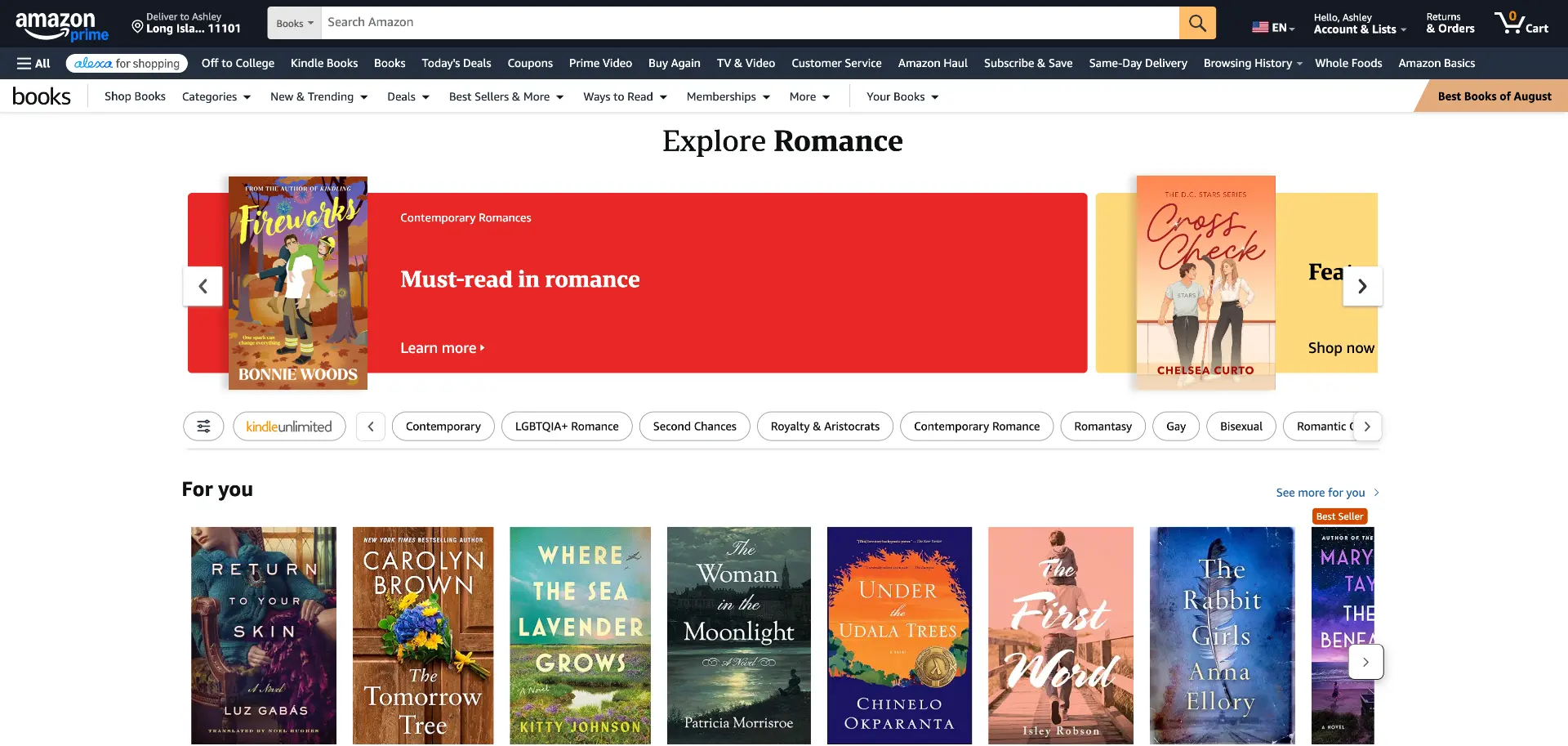
The rotating billboard carousel, as launched.
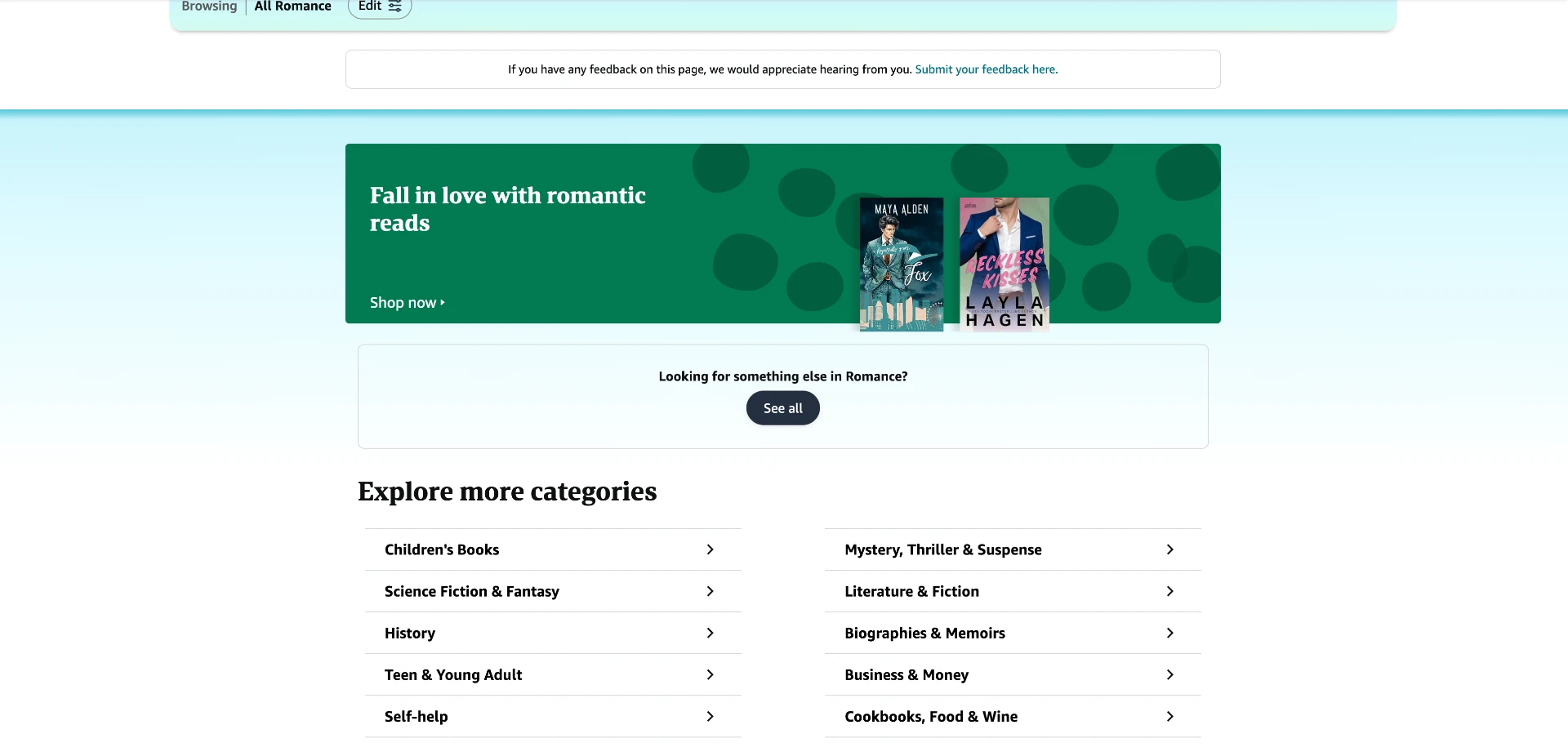
The static mid page banner that shipped in place of the full parallax experience.
Mobile design
The rotating billboard carousel and the midstripe banner both carry the same color mapping system to mobile, where most Books genre page traffic actually happens.
The outcome
increase in clicks on the rotating billboard carousel, measured over the launch month weblab
increase in click through rate on the rotating billboard carousel year over year, outperforming the average click through rate across non Books category page billboards elsewhere on Amazon
The rotating billboard carousel launched first. The results from the weblab were immediate: a 200% increase in clicks measured over the launch month versus the previous banner format. Click through rate rose 50% year over year, outperforming the average click through rate across non Books category page billboards elsewhere on Amazon.
Publishers responded enthusiastically. The feedback from marketing managers was that publishers genuinely loved the new designs, the color, the sophistication, the way the books broke out of the frame. It felt like a meaningful step up from what had been there before.
The technique of having books bleed outside their container started spreading to other designers in the Books org. It was not a design system change or a formal directive. It just spread because it worked.
Reflection
What I would do differently
I would talk to publishers myself. Everything I knew about what publishers wanted came through marketing managers, four of them across different marketplaces, each with their own interpretation of what the publishers in their portfolio were saying. That is a lot of filtering between me and the actual insight. I was junior, I did not know I could have pushed for direct access, and the marketing managers were protective of those relationships for good reason. But if I ran this project again I would find a way to sit in on at least one publisher conversation. Just to listen.
What I am most proud of
Not the metric everyone points to.
The parallax experience never launched, and looking back, that's fine. What I actually walked away with wasn't the design itself, it was proof that "nobody here has done this before" doesn't have to be a dead end. I could have let that be the reason to simplify early and play it safe. Instead I went looking for the people who did know, wherever they happened to sit in the company, and built something real out of what they gave me. That instinct, that not knowing how isn't the same as not being able to find out, has shown up in almost everything I've designed since.
The book bleeding technique taught me something different: that a small, confident visual choice can outlive the project it was made for. I didn't set out to influence how other designers approached their own work. It just held up under its own logic, and that was enough.