Work / A La Carte Recipes
A La Carte Recipes
Product Designer, Design Lead · 2026–Present
A note on this case study
A La Carte is a fully built, production ready product currently in final pre-launch preparation. There are no post-launch metrics to report yet. What this case study offers instead is something harder to demonstrate inside a large organization: the full arc of product thinking, from a personal frustration to a production ready website, led entirely by me on the design and product side.
At Amazon, I designed within a system. There were product managers, researchers, creative directors, and VP reviews. This project stripped all of that away. Every design decision, every product call, every interaction and visual choice was mine. A developer I worked with handled the engineering implementation and brought the product to production. This is what my thinking looks like when I own the problem end to end.
The story
"What would it take to give any recipe, from any source, the HelloFresh experience?"
That question became A La Carte.
I was a HelloFresh subscriber. Every week a box showed up at my door with portioned ingredients and laminated instruction cards. It was genuinely convenient. But around month three, I started noticing something in a cooking Reddit community I was part of: everyone was saying the same thing.
The meals were fine. But they were never your meals. Not the dish your grandmother made. Not the recipe from the cookbook you bought two years ago and never opened. Not the thing you ate on a trip that you've been trying to recreate ever since. HelloFresh gave you convenience, but took away the part of cooking that actually matters to people: the food that means something to them.
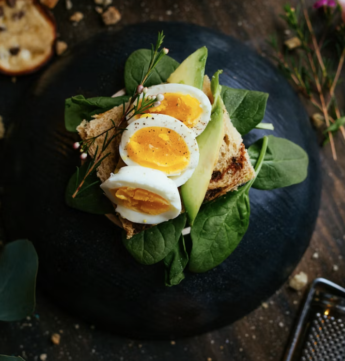
I started asking friends who used meal kit services what they actually wished they could cook. The answers were pretty consistent. Heritage dishes. Family recipes. Handwritten papers that were hard to follow because there were no pictures or instructions assumed you already knew what you were doing. One friend told me she had her grandmother's recipe for a dish she grew up eating in Thailand, but had never attempted it, because she had no idea what each step was supposed to look like.
That stuck with me. When I went back to the Reddit thread and read the complaints more carefully, the same pattern showed up everywhere. People weren't frustrated because the food was bad. They were frustrated because the food was never theirs. Cookbooks were collecting dust not because people didn't want to cook from them, but because shopping for the ingredients felt like too much work.
Composite sentiment from conversations and cooking communities, not verbatim quotes from a single study.
Defining the product
The earliest version of A La Carte in my head was simple: upload a recipe, parse the ingredients, help you order them. Snap a photo of a cookbook page and have the ingredients at your door by tomorrow. I loved that idea. It was clean, direct, and solved the exact problem I kept hearing about.
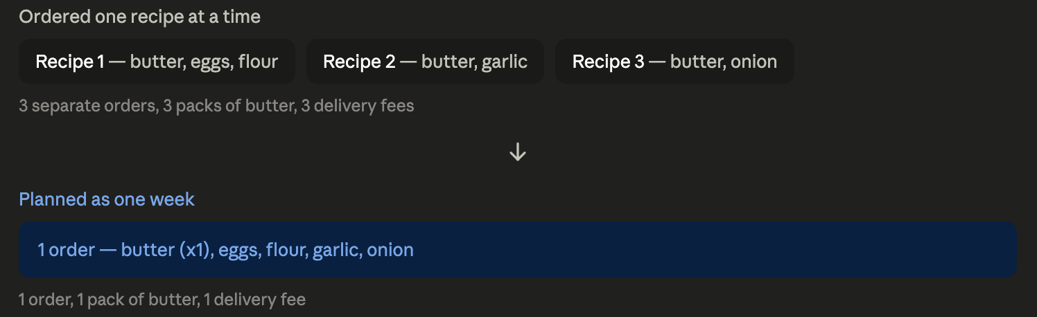
But the more I sat with it, the more something felt missing. To be honest, ordering one meal at Grubhub or Uber eats is very daunting these days because those taxes and delivery fees are ridiculous. Can't imagine someone ordering groceries for just one meal. If you're paying a delivery fee for one meal's worth of ingredients, the economics feel off. You're spending the same fee whether you order for one dinner or five. And most people don't cook just one meal in a week. They need to feed themselves multiple times.
So the question became: are we a recipe shopping product, or a meal planning product? That sounds simple. It isn't. A recipe shopping product optimizes for speed and simplicity. A meal planning product optimizes for habit and value. Different homepages, different core interactions, different reasons to come back.

I landed on meal planning as the foundation and entry point, with recipe uploading as a premium feature. Plan your week, order everything at once, and the delivery fee spreads across five meals or more instead of one. Ingredients that show up in multiple meals consolidate into a single order, one pack of butter for the whole week, not one pack per recipe.
The product becomes something worth building a routine around. That decision didn't just shape the homepage. It shaped what I could afford to build next.
One of the things I kept hearing in my research was that step-by-step instructions weren't enough on their own. A bulleted list doesn't tell you what things should look like. If a recipe says to add flour and mix, you don't know if the batter should be thick or thin, whether what you're looking at is right or a sign something's gone wrong. AI-generated images for each cooking step solve that, a visual reference for exactly what the dish should look like at that stage. For someone cooking their grandmother's recipe for the first time, that's not a nice-to-have. That's the feature that makes the recipe actually cookable.
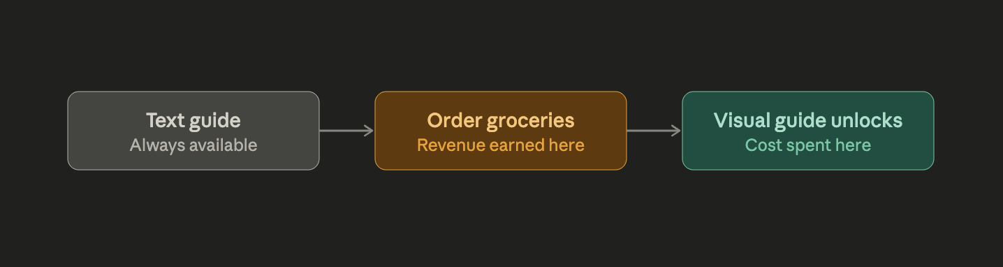
The problem: generating images is far more expensive than generating text. If every user who uploads a recipe gets a full visual guide, the cost breaks before the product has made a dollar. This is exactly where the meal planning decision paid off. Because the product was built around getting people to order groceries, not just browse recipes, I had a natural checkpoint to work with: the text guide stays available to everyone, always. The visual guide unlocks only after a user clicks through to order their ingredients. Ordering is the signal that someone is genuinely cooking this meal and will actually use the visual guide, and it's also the moment the product has already earned affiliate revenue. The image generation cost only gets spent once the business has already been paid.
How I approached it
The Story section covers how the idea surfaced. What came next was making sure I wasn't just building on a feeling.
I wrote a product requirements doc: what the product actually was, what problem it solved, and what its core value proposition needed to be before I let myself get distracted by features. It's a habit I picked up from watching product managers at Amazon do the same thing, and it turned out to matter just as much working solo. Without a PM in the room to hold that line, the discipline had to come from me.
Only after that did I move into design. I looked at how HelloFresh and Blue Apron approached their own products, not to copy them, but to understand what patterns customers already trusted. I built out a mood board from Pinterest, Behance, and Dribbble to find a visual direction and start shaping a branding kit.
Then came a decision I hadn't expected to make: how to actually build this. I considered the familiar path, Figma, full prototyping, the way I'd design anything at Amazon. But I was in the middle of learning Lovable at the time, and I saw an opportunity to do both at once: build a real, working prototype of the product while getting genuinely fluent in a tool that was going to matter for how I worked going forward.
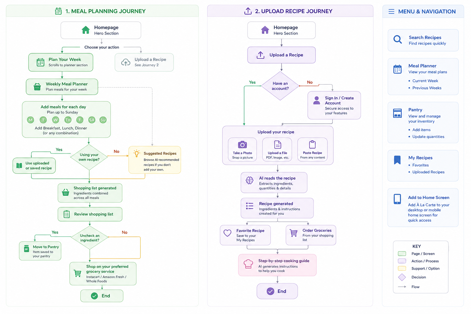
Before any screen got designed, I mapped the full user flow: every path someone could take through the product, every decision point, every branch. This is a habit that matters more in UX than people outside the field tend to realize.
How I designed it
The homepage question
The hardest design question on the homepage was how much information a user needed to see before they could start using the product. Too much explanation and you have a page full of text nobody reads. Too little and users don't understand what they're looking at.
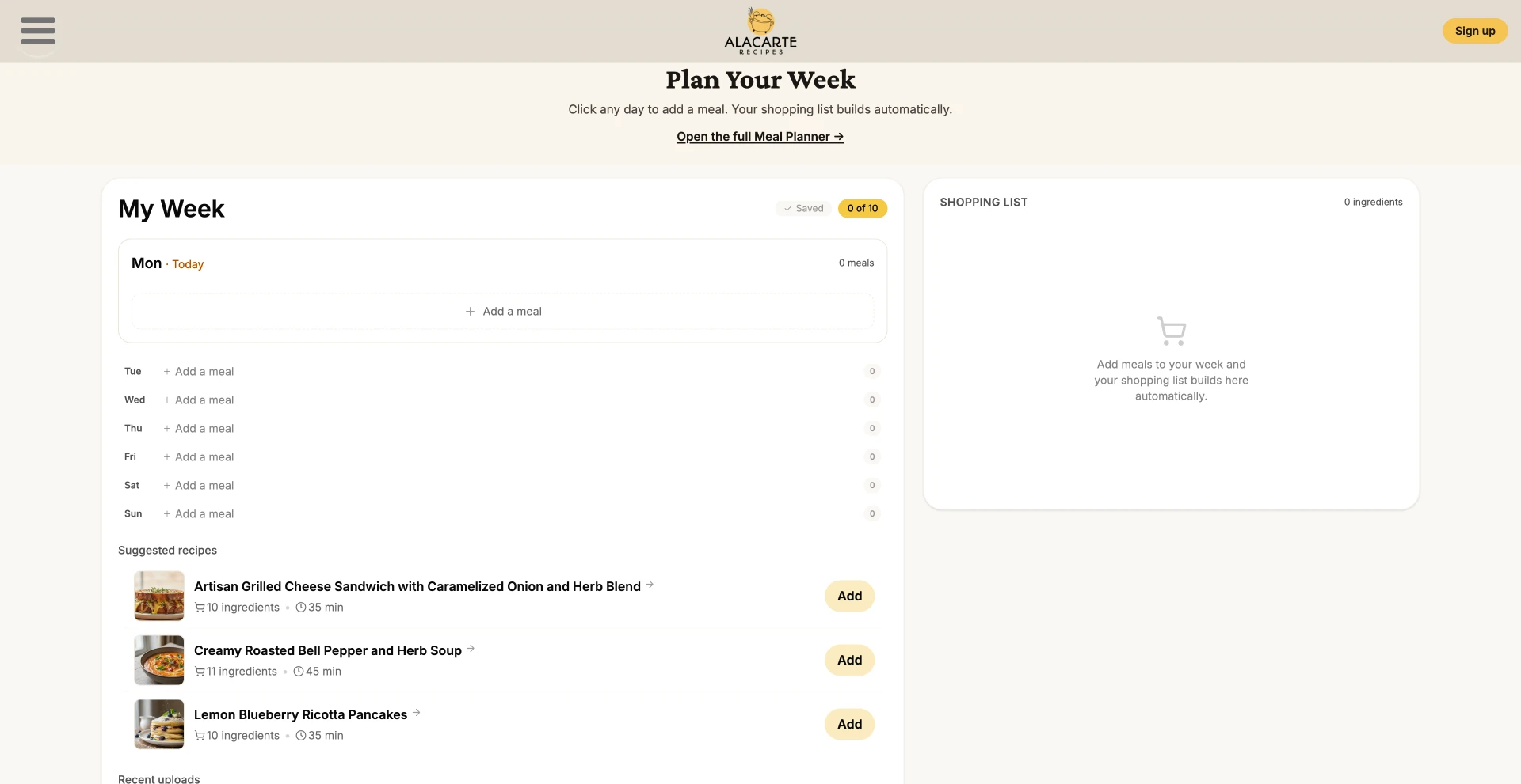
I settled on a hero section that communicates what the product does in a single glance, followed by a brief scannable how-it-works section, then immediately the meal planning interface, where users can start building their week right there on the page without signing up first. The goal was to get someone to the moment the product clicked for them before asking anything of them.
I took inspiration from how New York Times Cooking, HelloFresh, and Blue Apron handle their homepages, but I was deliberate about not reinventing what already works.
Building the brand
The visual identity started with a mood board, and one direction jumped out immediately: stencil-style line art. There was something about it that felt right for cooking, playful without losing the sense that food could actually look delicious.
The logo is a stenciled pot with steam rising off it, and that same hand-drawn line-work carries through the site: hands kneading dough, whisking, chopping, vegetables rendered the same way.
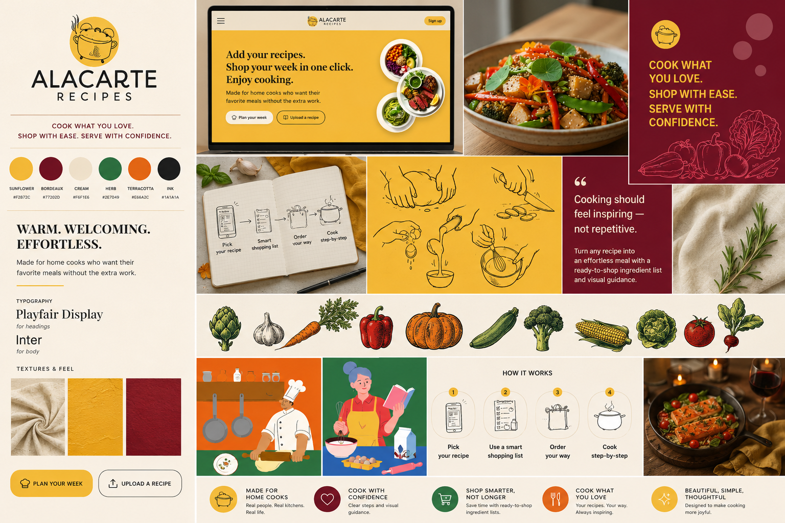
Color followed the same instinct. Sunflower yellow (#F2B72C) became the primary color because it reads as warm and inviting without feeling like it's trying to sell you something, the same way green reads as fresh or vegetable, yellow reads as warmth and appetite. Bordeaux (#77202D) shows up where the mood shifts toward something more evening, more date-night.
Typography paired Playfair Display for headings, giving the brand some editorial warmth, with Inter for body copy, keeping the actual product usable and legible. The same pairing you'd find on a well-designed recipe blog.
What changed along the way
The input flow changed significantly from the original concept. My first instinct was to have users upload a file. But that meant before they could do anything on the site, they needed to have a file ready, which added friction before the product had delivered any value, thus on mobile a user is able to snap a photo.
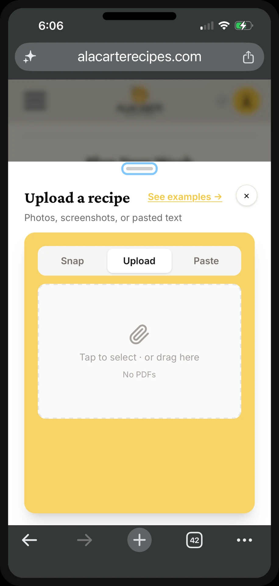
The shift to making Snap the primary input changed the flow entirely. On mobile, tapping Snap routes directly to the phone camera. You open the cookbook, snap the page, and the recipe is in your meal plan in seconds. Desktop keeps the upload option for users working from a computer, and there's also a paste-from-AI option for people who generated a recipe using ChatGPT or Claude and want to cook it.
Users also need to sign in before using this feature; this is because it is the point where users are sending content to our server, and we needed to prevent bots and spam uploads. Browsing suggested recipes doesn't touch that, so it stays open with no account needed.
Building with AI-assisted tools
On the design and product side, I used Lovable for rapid front-end development and Claude for product strategy, copywriting, and prompt refinement for lovable (because a bad prompt could ruin the whole project). A developer I worked with handled the engineering implementation, managing the codebase, organizing the architecture, and bringing the product to production.
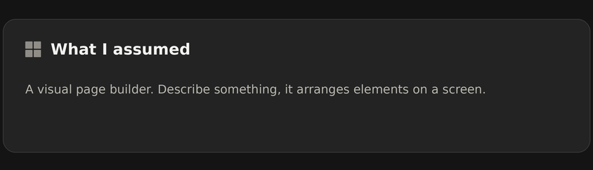
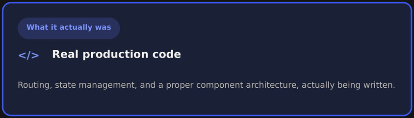
What surprised me most about working with Lovable was what was happening underneath the surface. I assumed it worked like a visual page builder: describe something and it arranges elements on a screen. What it was actually doing was writing real production code, building a functional web application with routing, state management, and a proper component architecture.
What exists today
A La Carte is a fully built, production-ready website currently in final pre-launch preparation. The following is complete and working:
— Interactive meal planning interface with real-time shopping list consolidation
Build your week, and the shopping list assembles itself in real time. No separate step to remember what you needed.
The meal planning experience on mobile, sped up for length. — Snap, upload, and paste-from-AI recipe input
Three ways in because recipes come from three different places: a cookbook on your counter, a file you already have, or something you generated in ChatGPT or Claude.
— Smart ingredient consolidation across multiple meals with package-size rounding
So you're not buying five separate half-teaspoons of cumin across five recipes when one jar covers the whole week.
— Serving size adjusters that recalculate all ingredient quantities automatically
Cooking for two instead of four shouldn't mean doing math. Adjust once, every ingredient updates.
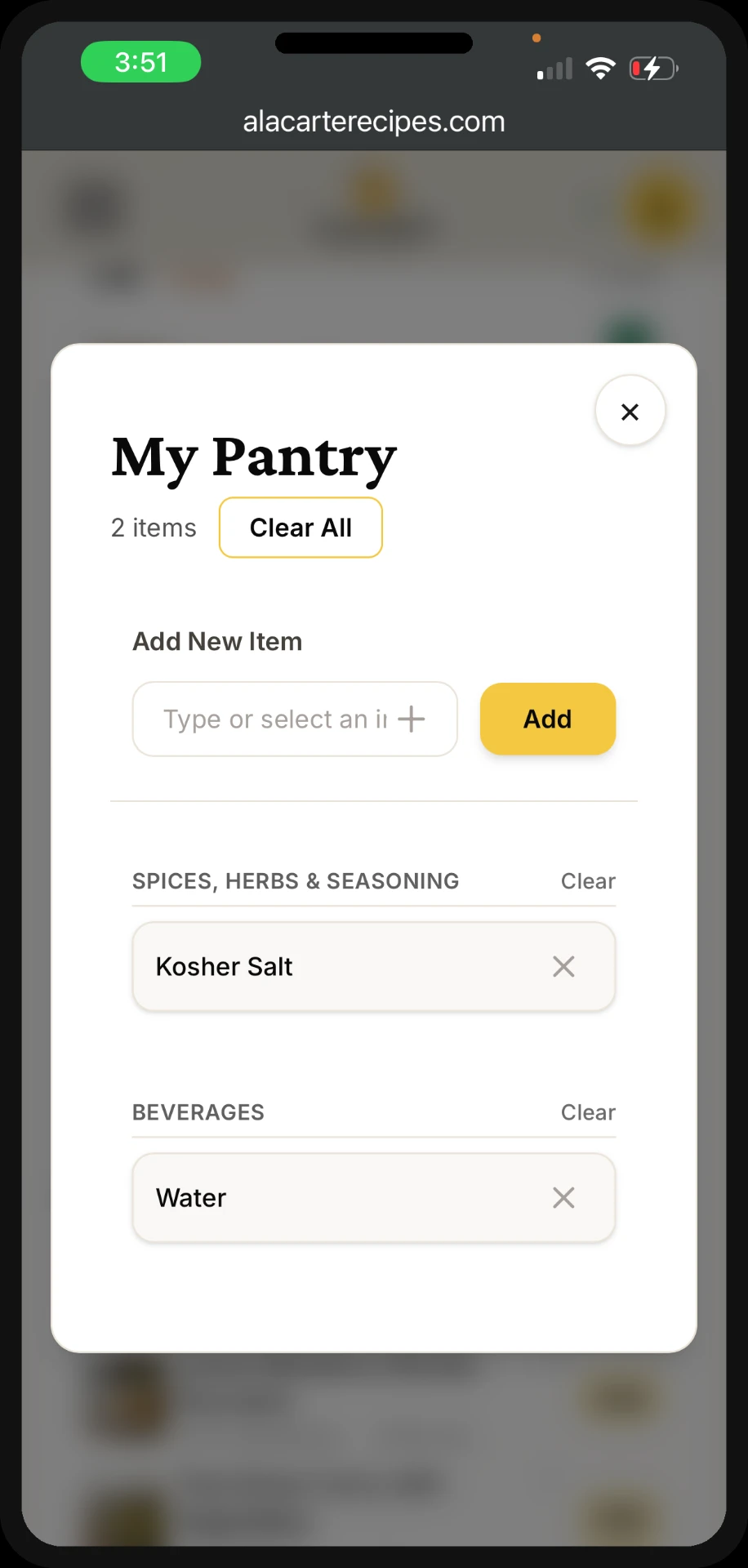
— Pantry tracking
So the app stops asking you to buy salt you already own.
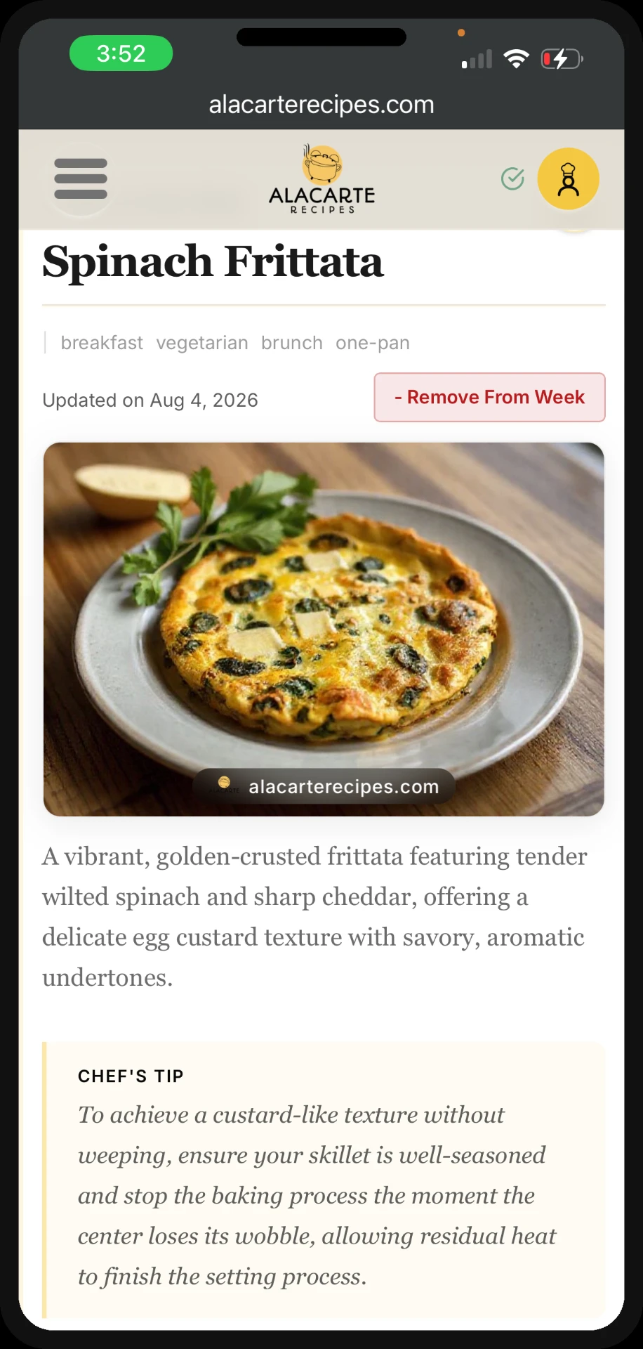
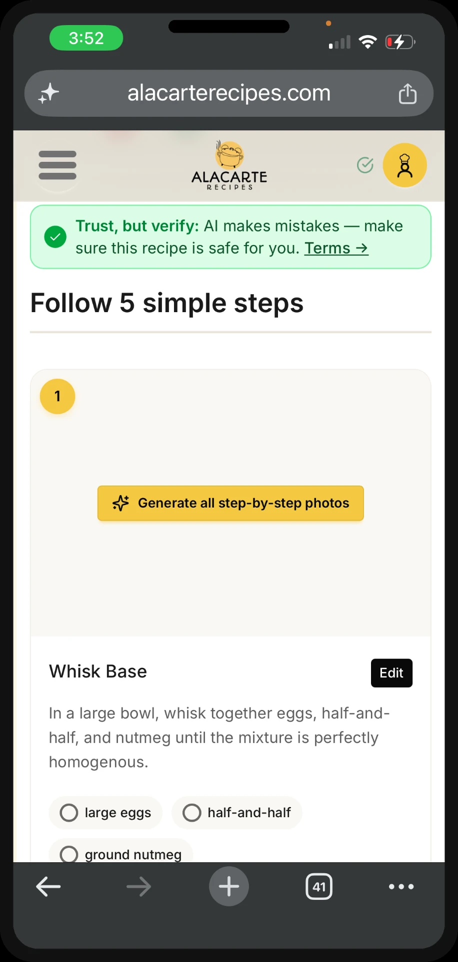
— Recipe detail page with step-by-step cooking guide, ingredient checklist, and substitution cards
A photo for every step means you always know what "fold gently" or "reduce until thick" is actually supposed to look like, not just read like.
— My Recipes and My Weeks
Every recipe you've uploaded or favorited, so you're not hunting for that one dish you made three weeks ago. Loved last week's plan? Reorder it in one tap instead of rebuilding it from scratch.
— Instacart and Amazon Fresh affiliate integration
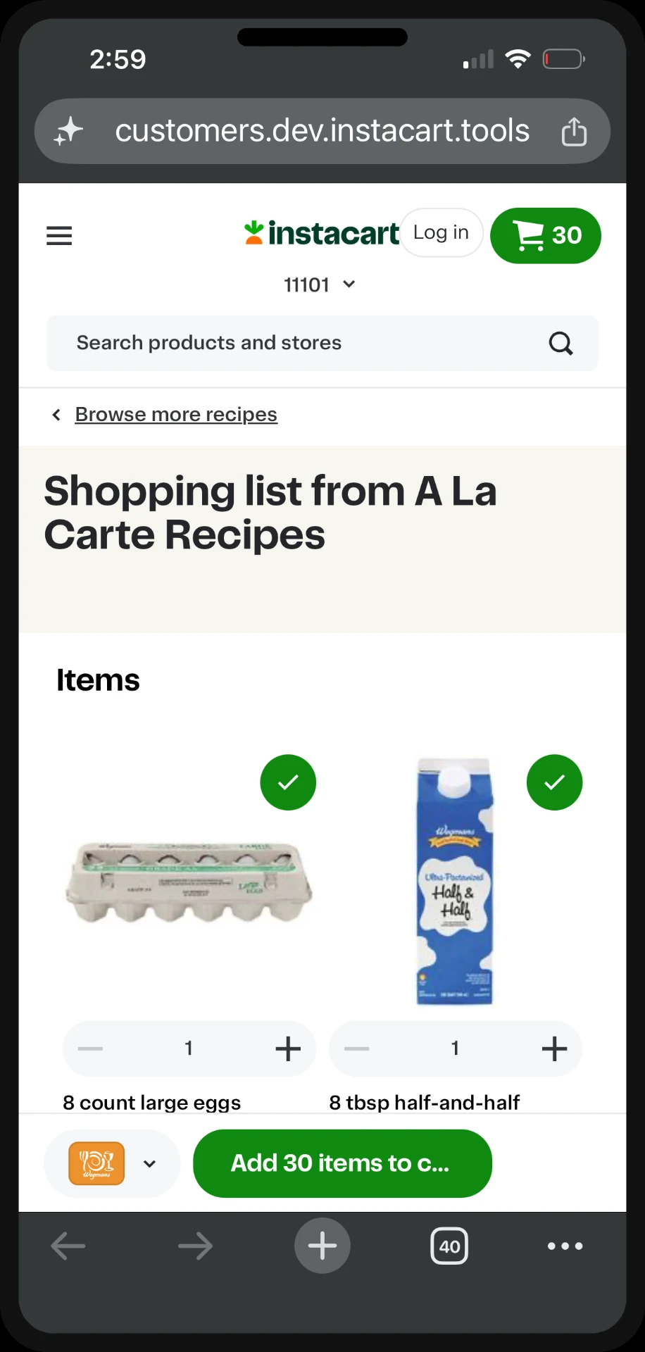
Metrics being tracked post-launch include meal plan completion rate, affiliate conversion rate, return sessions within 7 days, and average meals per plan per week.
Previous project
Publisher MerchandisingNext project
Shared Recommendations Framework