Work / Books Quickview
Books Quickview
Amazon · Design Lead, Desktop Experience · 2023–2025
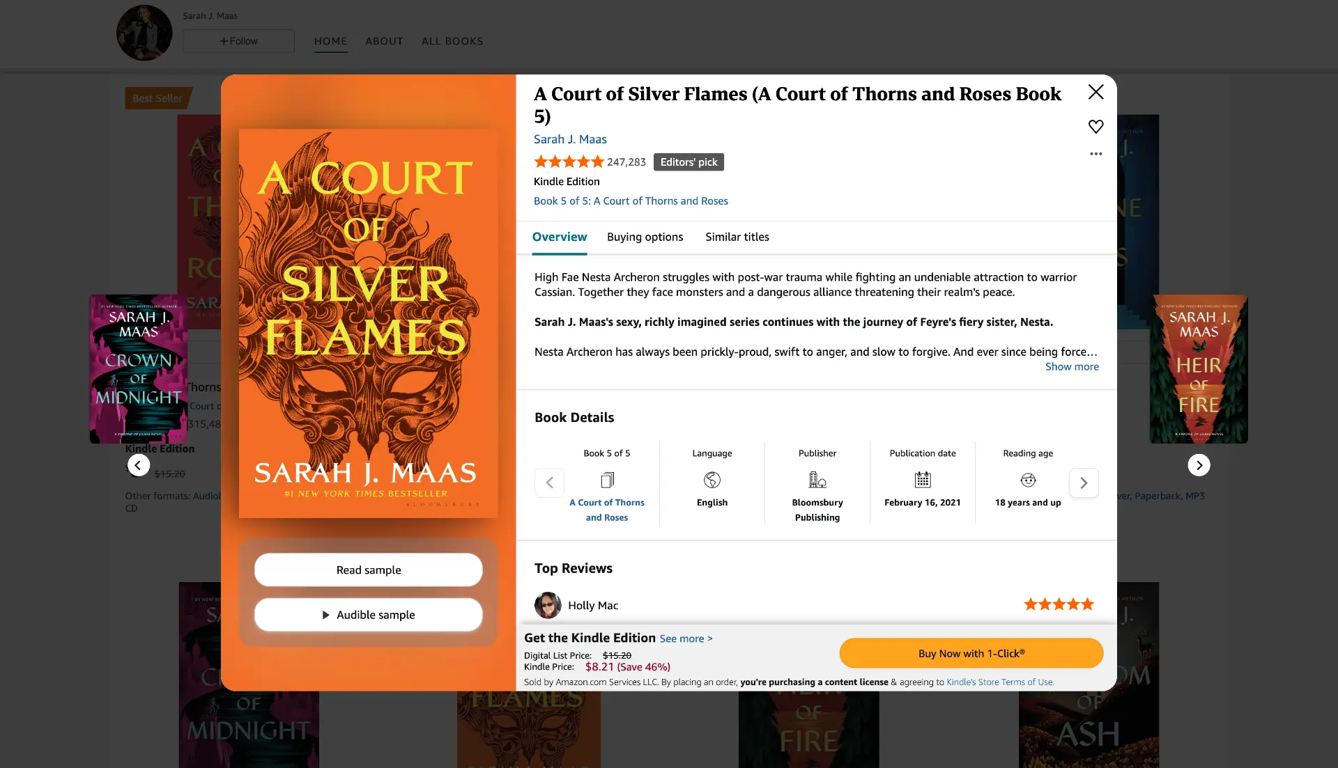
Design Goals
Project Timeline
The Story
"Every time a customer clicked on a book they were curious about, they left the page they were on. Discovery required interrupting discovery. That's the problem we set out to fix."
Every time a customer wanted to evaluate a title, they were taken to a full detail page. Their discovery flow would break. Their context would disappear. And the momentum that makes someone buy a book they didn't know they were looking for? Gone.
Across the Books org, every team had built their own version of Quickview for their specific use case. Engineering was managing a sprawling ecosystem of one-off solutions with no shared foundation. How might we help customers evaluate books without disrupting discovery, while replacing fragmented Quickview experiences with a single scalable platform?
My role: Design Lead, Desktop Quickview. I owned the end-to-end visual, interaction, and motion design of the experience, from early concept through to launch. I ran the usability research, facilitated cross-team alignment workshops, and collaborated directly with engineering on the motion system.
The sections below walk through how I got there.
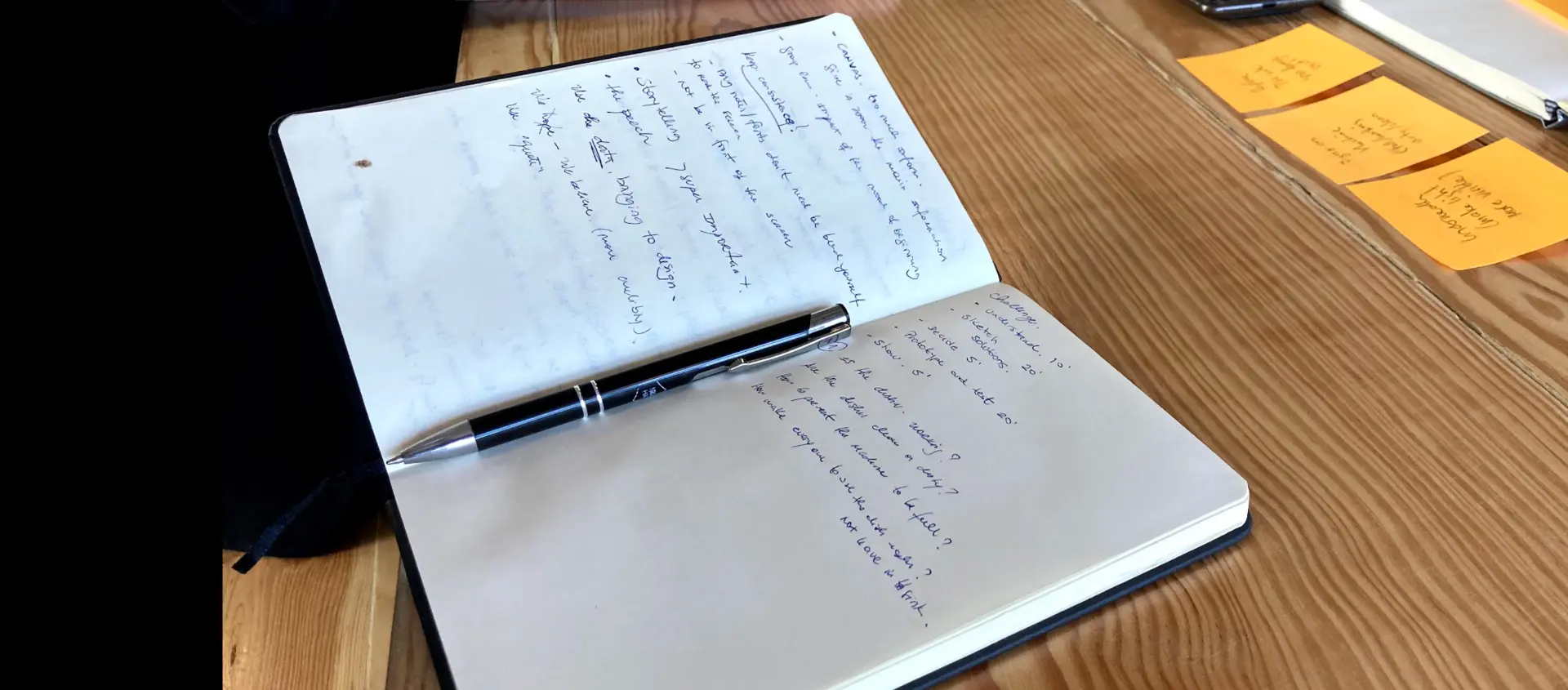
Early thinking — sketching the discovery problem before touching Figma
For Customers
Browsing books on Amazon meant constantly interrupting yourself. Every tap on a title sent you to a full detail page, a context switch that forced you to navigate back, refind where you were, and rebuild momentum. There was no way to evaluate multiple books in one continuous flow.
We already had a signal that this mattered. A Quickview existed on the Amazon Your Books page, a lightweight drawer that let customers peek at a book without leaving the page. The data was clear:
The appetite was there. The experience was not.
For the Business
Every team within Books had built their own version of Quickview for their specific use case. Ads had one. Your Books had one. Amazon Charts had one. European teams had their own. Engineering was managing a fragmented ecosystem with no consistency and no way to scale.
The goal was to consolidate: build one Quickview to serve them all, reduce engineering overhead, and unlock a shared foundation that any team could build on.
Discovery
"Customers in discovery mode don't want to be pulled out of the rabbit hole. They want to go deeper."
My assumption going in was the opposite. Research changed everything.
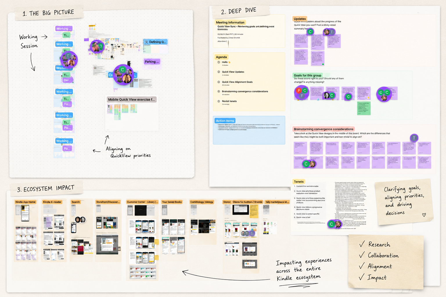
FigJam workshop sessions with designers across the Books org. Faces obscured to protect team members' privacy.
Before touching a single frame, my design partner and I ran weekly FigJam workshops with every designer across Books who had contributed to a Quickview. We were not designing yet. We were listening.
Research showed that customers in discovery mode actually enjoy the rabbit hole. Diving deeper into similar titles, building a mental map of what they might read next. That is the experience. Not an interruption. The discovery is the point.
This single insight reshaped how we thought about the whole experience. We were not building a utility. We were building a discovery engine.
It also surfaced something we had not planned to include: Add to List. The Add to List insight was the one that surprised me most. I had not anticipated it. But once the research surfaced it, the gap was obvious. If customers were going down rabbit holes through similar titles, they needed a way to save what they found. It became one of the most used features in the final product.
The Design Process
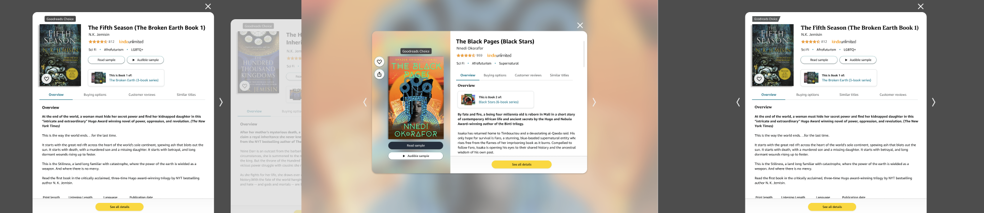
Early explorations before landing on the final direction
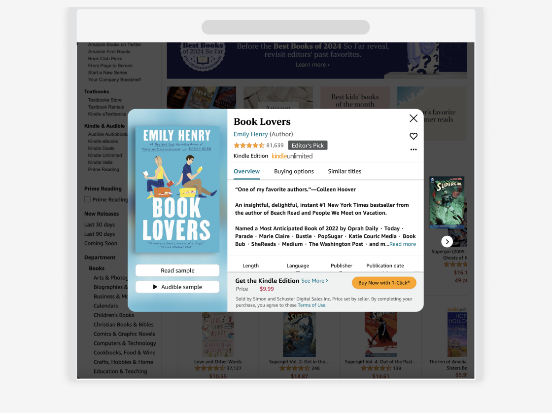
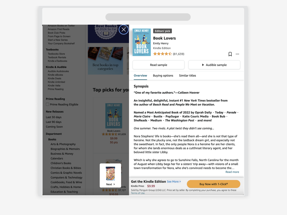
Modal, not side sheet
The first structural decision was the one that shaped everything else. Should Quickview live in a vertical side sheet or a modal?
The side sheet was the safer choice. It was familiar and established. But it had a fundamental problem: swiping between multiple Quickviews was clunky in a vertical container. The discovery experience, moving fluidly from book to book and rabbit-holing into similar titles, did not work in that format.
The modal gave us room. It gave us horizontal motion. It gave us a canvas to design something genuinely immersive. I chose the modal.
From side sheet to modal
The immersive split view
Once the container was decided, I focused on what the experience inside it should feel like. The Books design system was built around the idea that books are magical, that there is something transportive about cracking one open. I wanted the Quickview to carry that feeling.
I landed on a split view. One half was the magic, a blurred zoomed in version of the book cover used as an atmospheric background, creating an immersive environment around the book. The other half was the utility, the evaluation zone where customers could read the overview, see formats and pricing, and browse similar titles.
Getting the blur right took more iterations than anything else on the project. The balance between immersion and readability is delicate. Too much blur and it looks muddy. Too little and the background competes with the content. I brought this back to my manager and creative director repeatedly until it was right.
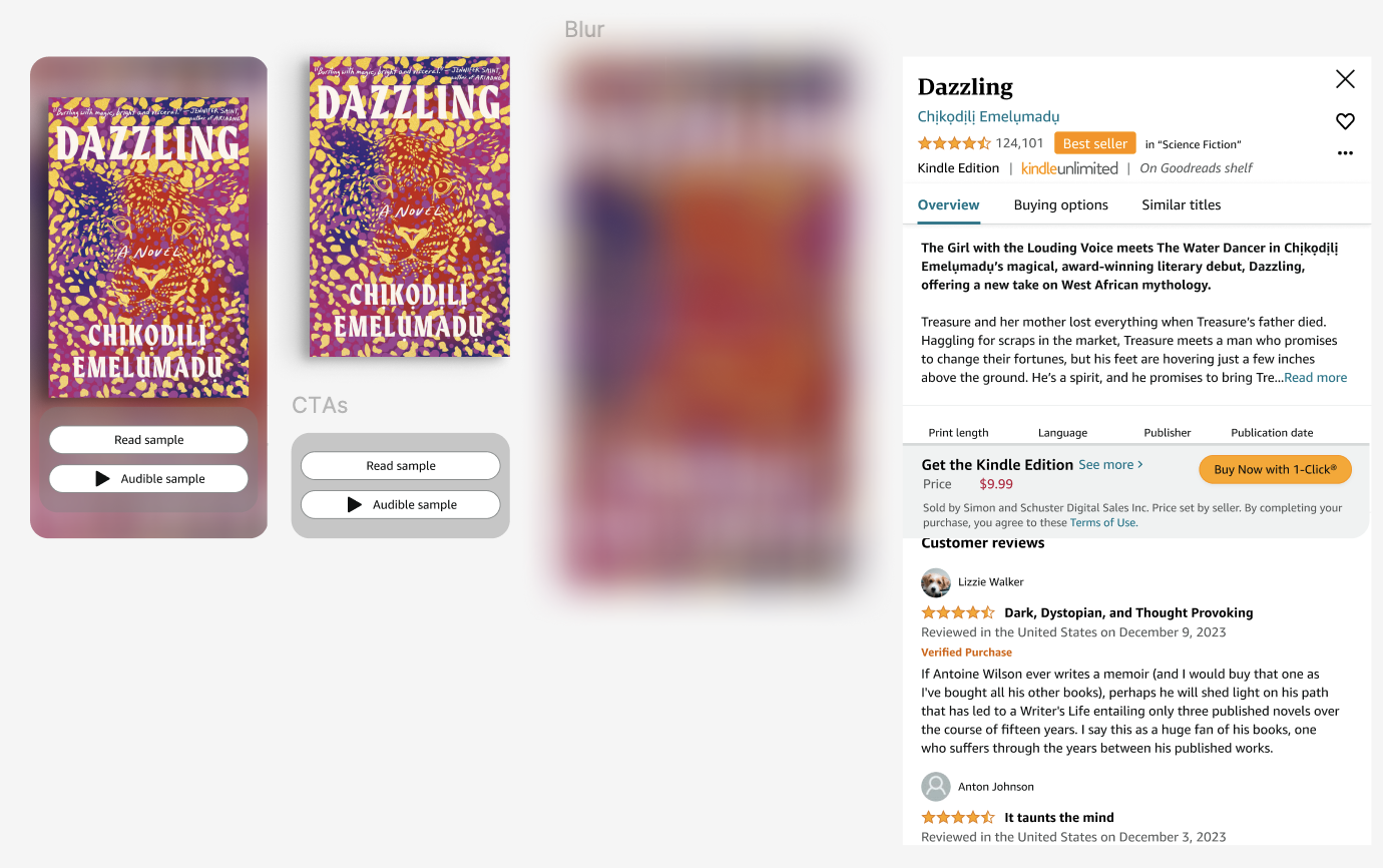
A breakdown of the split view components, the atmospheric blurred background, the book cover, and the utility panel, each designed independently to serve a distinct purpose
Scrollable header that collapses
Collapsing header interaction
Making the modal scrollable introduced a new problem. The header held essential book information but was tall. Combined with the persistent purchase bar at the bottom, it left very little visible content area for the customer to actually evaluate.
I designed a collapsing header system. As the customer scrolls down, the header condenses to a single line and the purchase bar minimizes. As they scroll back up, the purchase bar expands first, reinforcing the idea that returning to the top signals intent to buy, and the header only fully expands when they are back at the very top.
The logic was deliberate: scrolling down means evaluating. Scrolling up means moving toward a decision. The UI responds to that behavioral signal.
Add to List and the long press debate
Add to List single tap interaction
Add to List was introduced as a heart icon in the modal. The original interaction proposed was a long press on the heart to surface list options, a pattern borrowed from mobile.
I pushed back on this for desktop. Long press is not a native desktop interaction. Most customers would not discover it. We would be hiding one of our key features behind a gesture nobody would think to try.
My usability test confirmed it. None of the eight participants thought to long press the heart. When asked, they said they were familiar with the gesture on mobile but only on mobile.
We landed on tap the heart to add to a default list. Access specific lists through the three dot menu. Long press stays on mobile where it is expected. Desktop gets an intuitive single tap experience.
Motion Design
Motion as navigation
I was worried about customers getting lost in the rabbit hole. It is one thing to design a feature that lets you dive into similar titles. It is another to make sure customers can always find their way back.
Motion became the solution. As customers swipe between books or dive into a similar title, the animation signals that they have entered a new book deck. The direction and character of the motion communicates orientation: you came from here, you can get back this way.
I worked directly with engineering to define the motion, timing, easing, how books fall into frame, how the transition reads when rabbit holing versus swiping. It was one of the most collaborative parts of the project and it paid off.
The Books team had not really explored motion before. This project opened the door. We started integrating motion into the Books design system as a result, something I actively pushed for, because motion is not decoration. It is navigation. It is feedback. It is a design tool we had not been using.
Product Demo
Books Quickview in motion, swiping between titles and rabbit holing into similar books
The Tensions
Should we show purchasing in a discovery experience?
This was the hardest call on the project and one I had to fight for. Conventional wisdom from prior data said: don't show a buy button to a browsing customer. They don't know if they want the book yet. Surface a purchase prompt too early and you create friction, not conversion.
But that logic assumed customers were in one mode at a time. Discovery or purchase. Never both.
We knew differently. Customers regularly purchase books similar to ones they have already read. The intent is there, it just arrives on its own schedule. We agreed on a test and learn approach: if customers weren't engaging with the purchase mechanism, we would remove it. When we ran usability testing with eight participants, the majority weren't bothered by it at all. Nobody felt it was intrusive. Several used it. The purchasing mechanism stayed.
Designing within a design system that didn't exist yet
Books was introducing a new design system while we were building, one that leaned into a visual philosophy of richness and immersion. The problem: most of the new components weren't production-ready yet.
I managed this by maintaining two parallel design tracks: a Northstar vision showing where we were going, and a current-state version that used ready components. I stayed in continuous conversation with engineering about component availability, updated designs as new parts of the system landed, and filled gaps with the existing Books design system where needed. It wasn't elegant but it kept us moving.
Usability Testing
Testing with real customers
I authored the full research plan, conducted the study on UserTesting, analyzed the results, wrote the research report, and presented findings to leadership. A Books researcher reviewed the plan before launch and joined me for debrief sessions twice before the study went live and once after to go through the data together.
What we found:
- All participants completed every task successfully, including adding to list, creating a new list, and finding a book of interest.
- Participants chose the gray purchasing container design over two alternatives when shown options side by side.
- All participants said the experience would meaningfully improve their ability to discover new books and evaluate titles.
- All said the flow felt significantly easier than navigating to a detail page.
- None discovered the long press on desktop, validating the decision to remove it from that platform.
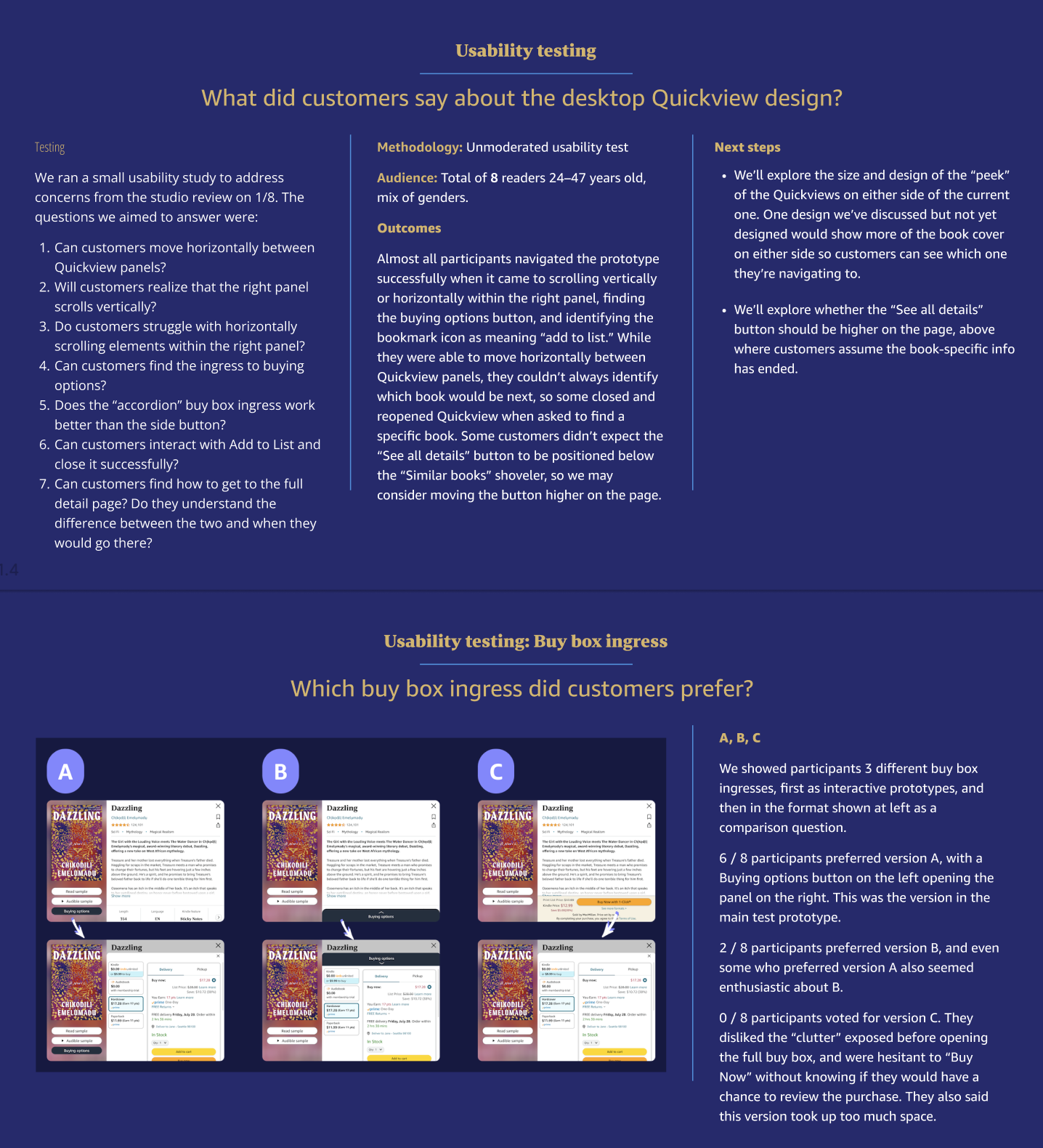
UserTesting study, N=8 participants, spring 2024
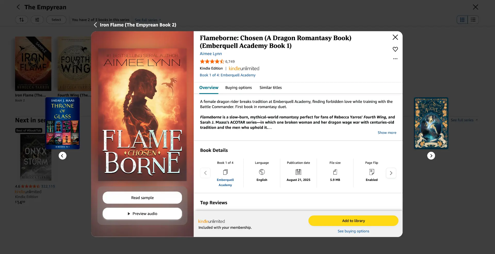
The final product, a Books Quickview experience.
The Outcome
Everything shipped. We launched on Author Pages and Your Books pages. The browsing and list-saving behavior was the real story. We hadn't set out to build Amazon's most-used list tool. But by creating a space where discovery and curation could happen together, that's what emerged.
Partner teams including Ads, Audible, and Goodreads started requesting integration. The Quickview became a platform conversation, not just a design project. It also contributed directly to my promotion to the next level within Amazon.
Reflection
What I'd do differently
I'd be messier, earlier. In team share-outs, I consistently showed up with polished, well-reasoned work. I thought that's what those sessions required. What I've since realized is that I was robbing myself of the most useful feedback, the kind you only get when your thinking is still rough enough to reshape. I was married to my ideas before I'd given my teammates a real chance to challenge them. Going forward I treat share-outs as thinking-out-loud sessions, not presentations.
What I'm most proud of
Motion. Books hadn't explored motion design meaningfully before this project. I introduced it as a functional tool, a way to help customers navigate the rabbit hole without getting lost in it. Working directly with engineering to define the timing, the easing, the behavioral logic of each transition produced something the team hadn't seen before. We started building motion into the Books design system as a direct result. Motion is a design tool, not a flourish. This project proved it could solve problems that layout alone couldn't.